
Responsive Sites?
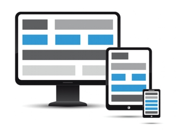
Responsive Sites and Updates…
With that all said, we must be sure to regularly look at our own websites to ensure that technology updates and changes do not affect the sites we have in place. Anyone who owns a cell phone, computer or and computer-driven device is aware that updates happen on a regular basis. Logically, this can affect our websites and how they appear. As a rule of thumb clients should expect and plan for major website updates and/or renewing every 2-3 years. This will help to ensure that your website is displaying as expected and help keep you up to the ever advancing technology.. that just simply keeps advancing and if you want to stay current and relevant… change is inevitable.
The good news is that, as a client of The Image Stop ltd, we give current clients discounts on future renderings of their websites simply because we value our relationships.
Not sure if your website is responsive? Try out this Responsive Recognition link and check it out to be sure.